Lazy Load Content Beautifully!
Published: 5 July 2017
Updated: 5 July 2017
I am sure a lot of folks are interested in learning how modern applications like Facebook, LinkedIn, etc. load the user feed behind the scene. It is obvious that these applications perform subsequent requests once the user is past the initial or current information feed. Explaining the entire process from start to end will need a series of articles.
In this article, I am going to take a shot at explaining the UX pattern used in Facebook’s production application. The explanation presented is based on my approach to developing such a UX, and this may not resemble Facebook’s actual implementation at all.
Using spinners is so old school
In the past, you may have noticed that a lot of single page applications were using spinner at the bottom of the page until the further contents were available for display. But with the rise and need of building more engaging web applications, the strategies for loading content has changed tremendously in recent years. For example, in the case of Medium, images are inherently larger in size, thus it might be a good strategy for Medium to show text as fast as possible compared to images thereby keeping the user engaged.
In my opinion, a single spinner is not fit to satisfy the new needs of the user, as well as, the developer’s desire to develop more engaging user experience, and this lead to the rise of content placeholders. Attached is a GIF displaying the placeholder card used by Facebook until the content for a feed is pending retrieval.
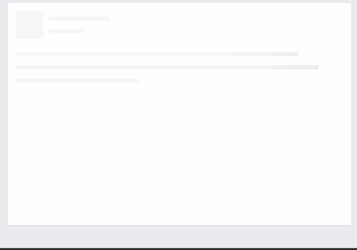
If you observe the GIF above carefully, you will realize that how Facebook’s content placeholder is establishing an abstract expectation for the user. The user expects to see an image on the left side and few lines of text on the right side, and having a placeholder also opens the door for implementing advanced data fetching strategies.
Enough theory, give me code
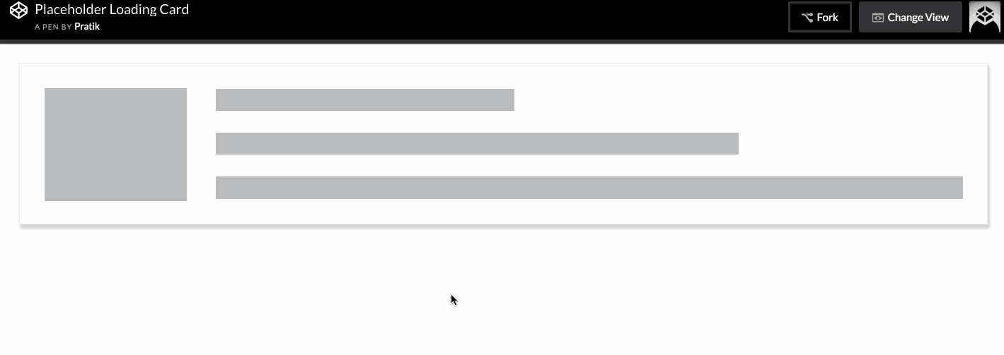
- Placeholder should be responsive.
- It should hint the user about the loading state.
- It should be light and performant on all sorts of devices.
- It should set up an abstract expectation for the future content.
Some of the requirements to keep in mind:
1. Making it responsive
Using Flexbox
Flexbox is a layout model that allows building responsive layouts quickly for newer browsers. You can check out the browser support at Can I Use. If you have not played with Flexbox yet, then this is a good place to start.
<!-- HTML structure for the placeholder -->
<div class="container loading">
  <div class="img-container">
    <div class="img"></div>
  </div>
  <div class="content">
    <div class="stripe small-stripe"></div>
    <div class="stripe medium-stripe"></div>
    <div class="stripe long-stripe"></div>
  </div>
</div>
/* Flexbox CSS rules for the container and children
(showing important declarations only) */
/* default flex-direction: row */
.container {
display: flex;
...;
}
/* set a width for image container */
.img-container {
width: 15%;
...;
}
.content {
/* grow till the end after 15% is given to image */
flex-grow: 1;
/* make this element a flex container with column layout to have text stripes */
display: flex;
flex-direction: column;
justify-content: space-between;
...;
}
/* set a height for the text stripe */
.stripe {
height: 20%;
...;
}
/* add random width values to give the effect of increasing text */
.small-stripe {
width: 40%;
}
.medium-stripe {
width: 70%;
}
.long-stripe {
width: 100%;
}Using Grid System
If you are not planning to use Flexbox then you can apply the same concepts to your grid framework.
2. Hint Loading
It is important that we make a subtle visual change to the placeholder, such that user gets the intention of an ongoing loading process. We can leverage a named CSS animation in an infinite loop to achieve the desired effect.
/* I advise that you should to tweak the numbers below to
visualize changes in the animation. You may even find
a new set of numbers that produces better change in states. */

/* select desired HTML elements */
.container.loading .img,
.container.loading .stripe {
  animation: hintloading 2s ease-in-out 0s infinite reverse;
  -webkit-animation: hintloading 2s ease-in-out 0s infinite reverse;
}

/* set up named animation keyframe */
@keyframes hintloading {
  0% {
    opacity: 0.5;
  }
  50% {
    opacity: 1;
  }
  100% {
    opacity: 0.5;
  }
}

/* don't forget vendor prefixes */
@-webkit-keyframes hintloading {
  0% {
    opacity: 0.5;
  }
  50% {
    opacity: 1;
  }
  100% {
    opacity: 0.5;
  }
}
3. Making it light and performant
Creating a basic shell for the placeholder will not require a lot of HTML markup or CSS thus the only thing we need to worry about is the animation. But since we are performing an opacity based animation which means it is not too expensive. Here is a great article explaining the performance implications associated to CSS animations.
4. Setting an abstract expectation
Having a shell close to the final state of contents is a good way to set user expectations. In the implementation above, I have added a placeholder for an image on the left and some lines of text on the right. You can easily change the layout based on your requirements.